Starting an early countdown to Te Wiki o te Reo Māori
Te Taura Whiri i te Reo Māori (the Māori Language Commission) and Te Mātāwai have issued an invitation to towns and cities across the motu to boost te Reo Māori so it is heard, seen and lived every day - above and beyond its celebration during Te Wiki from 14-20 September.
Under the theme Ake, Ake, Ake – A Forever Language, the 2026 focus is Te Reo Towns - a celebration of the communities who have kept te reo Māori alive, and a call-out for all of Aotearoa to help it flourish into the future.
The practice of being a landscape architect, of and in this place we call Aotearoa New Zealand and over many decades, has seen countless individual and collective te reo Māori journeys commence apace, as both personal and professional commitments that keep on keeping on.
In the lead-up to Te Wiki o te Reo Māori 2026, Landscape Architecture Aotearoa (LAA) will be highlighting some examples of respecting this taonga. And what better way to open this than borrowing a think-piece from LAA contributor Nick Kapica, a thinker of many parts (Experiential/ Graphic/ Urbanist)
We set both languages in the same typeface. Here’s why that matters.
by Nick Kapica
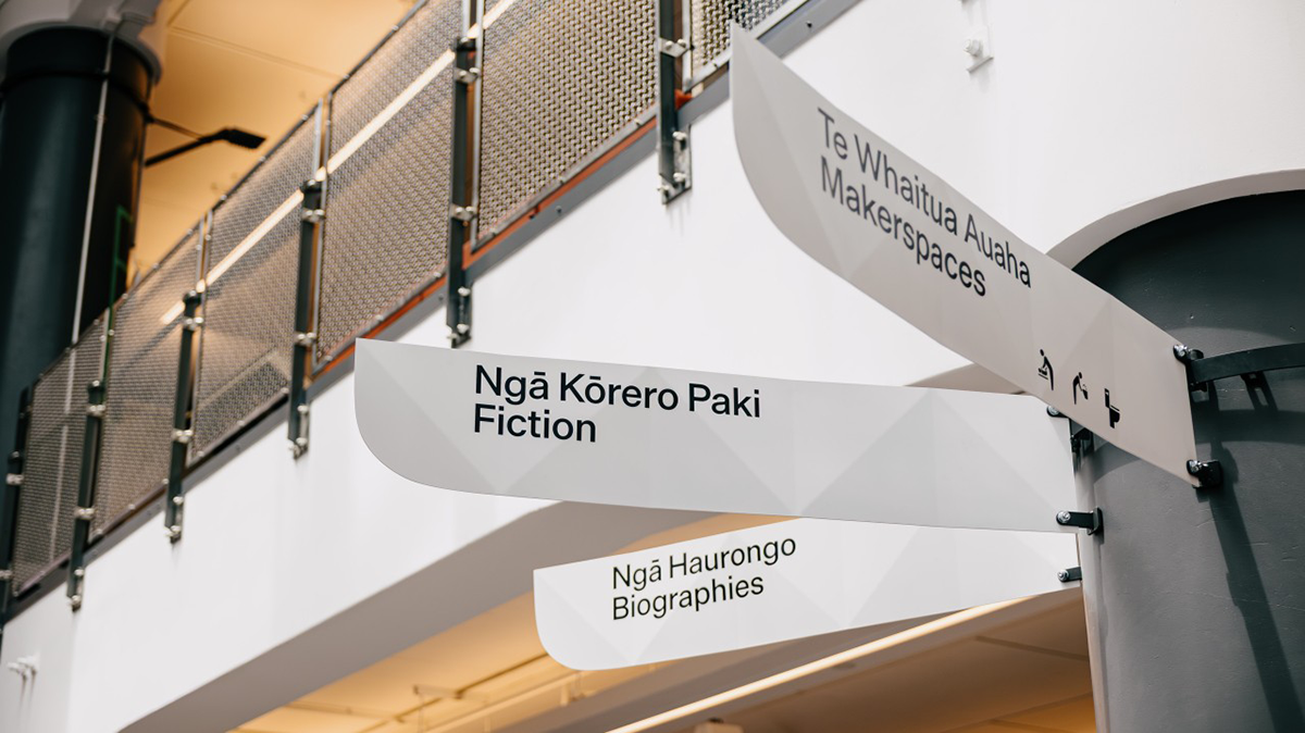
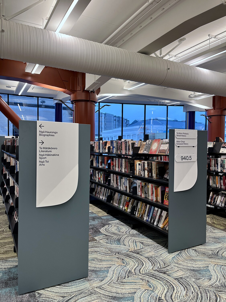
On a recent wayfinding project—Te Matapihi ki te Ao Nui—a deliberate decision was made that te reo Māori and English appear in the same typeface, the same weight, the same size. No differentiation. Hierarchy is established through language order alone, with te Reo Māori placed first. This isn’t minimalism for its own sake. It’s grounded in purpose—and purpose, in bilingual signage, is not universal.
There are three distinct reasons an environment might carry more than one language. The first is compliance: countries with multiple official languages—Belgium, Switzerland—are legally required to represent them. The second is assistance: helping visitors navigate a place where they don't speak the local language—English wayfinding in Denmark, for instance. The third is revitalisation: actively restoring presence and standing to a language that has been historically marginalised—Wales, Canada, Aotearoa New Zealand.
These are not the same problem. They do not demand the same solution.
Te Reo Māori is placed first because it is the language we are revitalising. It has been marginalised—systematically, historically—and placing it first is an act of restoration, not decoration. It is also the language that is unique to this place. English is spoken everywhere. Te Reo Māori is spoken here. That specificity matters: it is what makes Aotearoa legible as Aotearoa, to its own people and to visitors, now and well into the future. And if revitalisation succeeds—as it should—the day may come when English on these signs is simply there for visitors who don't yet understand Te Reo Māori. The assistance layer and the revitalisation layer will have swapped places entirely.
Where are we getting our references from? Most of what designers and clients find online lands in the first two categories—and the assistance category dominates. Think English-language wayfinding in Denmark. Considered, authoritative—and built on a hierarchy where the local language is primary and the visitor language is a service layer. In that context, the subordinate position is defensible.
But that logic does not transfer. Importing those conventions into a revitalisation context doesn't just produce the wrong result—it actively encodes the wrong relationship between the languages. The reference pool most designers and clients are drawing from is not neutral. It was built for a different purpose entirely, and following it uncritically is how inequality gets embedded in the built environment without anyone quite intending it.
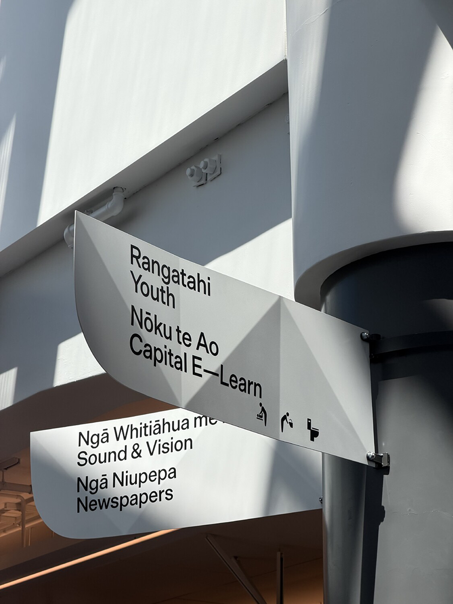
In a revitalisation context, the design question isn’t ‘which language do most readers need?’ It's ‘what does this environment say about the standing of this language?’ Those are different questions, and they lead to different answers.
There is an established framework for this work in Aotearoa. Te Ture mō Te Reo Māori 2016 affirms Te Reo Māori as the indigenous language of Aotearoa New Zealand, a taonga of iwi and Māori, and an official language of the nation. The same year, Te Puni Kōkiri and Te Taura Whiri i te Reo Māori published their guide to Māori-English bilingual signage, grounded in international best practice—Irish, Welsh, and Scottish bilingual frameworks among them. The guide's equality principle is clear: both languages should be equally easy to read, with the most textually parallel and equivalent design possible. Te Reo Māori first, at least equal in size, never subordinated through weight or colour. This work sits within that framework and affirms it.
The guide also identifies language differentiation as a key design element—the idea that the eye should be able to spot the difference between each language at a glance—but this is where neuroscience disagrees and suggests equal typographic treatment doesn't require a trade-off with legibility. Electrophysiological research shows that bilingual readers identify the language of a word automatically and unconsciously within approximately 200 milliseconds of seeing it—well below the threshold of conscious awareness. Both languages are briefly activated simultaneously, and the brain selects the appropriate one without any need for typographic guidance. Crucially, the same research shows that monolingual readers are equally fast at detecting that a word doesn't belong to their language—within that same 200 millisecond window, even when the word follows the spelling rules of their own language. The brain is already sorting. Typographic differentiation adds nothing to this process. The brain does the work regardless.
So what does typographic differentiation actually do? It makes a cultural statement. It tells one language it's primary and the other it's secondary. And in a wayfinding context intended to support language revitalisation, that's precisely the wrong message to embed in the built environment.
There’s a common objection: won’t equal treatment confuse monolingual readers? The neuroscience pushes back on this. The Visual Word Form Area—the brain’s dedicated reading centre—responds far more strongly to familiar letter patterns than to unfamiliar ones. A monolingual English reader won’t deeply process Te Reo Māori text because the brain simply doesn’t automatically activate for orthography it hasn’t learned. The familiar language surfaces on its own. It doesn't need to be made visually dominant to be found.
Some will accept language order—Te Reo Māori first—but still argue for typographic differentiation: make one bold, they say, so I can find what I need. But this misunderstands what the brain is actually doing. The reader isn't scanning both languages and then choosing. They’re not even seeing the unfamiliar language in any meaningful sense—the VWFA is simply not firing for it at full depth. The familiar language isn't hidden inside equal typography waiting to be excavated. It’s already surfacing automatically. Differentiation doesn't assist that process. It just makes the hierarchy visible—which is precisely the problem.
Research adds another dimension here. A study published in the Interdisciplinary Journal of Signage and Wayfinding found that perceived processing difficulty with bilingual signs is most strongly predicted by a reader’s level of ethnocentrism—readers with low ethnocentrism showed no significant effect at all. The study raises the question of whether reported difficulty among high-ethnocentrism readers reflects a genuine cognitive challenge or an attitudinal response. It doesn’t resolve that question, but the implication is uncomfortable and worth sitting with: discomfort with bilingual signage may correlate with attitudes toward linguistic diversity rather than any actual difficulty in reading.
That distinction matters for how we respond as designers. Which raises an uncomfortable question: if we reduce one language to smaller, lighter, bolder—to reduce ‘difficulty’—whose difficulty are we actually solving for? If the difficulty were genuinely cognitive, we'd expect it to be reported consistently across reader groups regardless of cultural attitude. It isn't. And adjusting Te Reo Māori to a smaller size or lighter weight in order to make it less confronting to readers who object to its presence would be to allow that objection to shape the built environment—and in doing so, to reinforce exactly the hierarchy revitalisation seeks to undo.
Equal typographic treatment isn't a compromise position. It’s a considered one. Removing typographic hierarchy doesn't compromise legibility. It simply stops encoding inequality into the signs we put on walls.
In decolonising Aotearoa, we need to be careful we are not recolonising it through poor typographic decisions.
About this project
Te Matapihi ki te Ao Nui is the reimagined Wellington Central Library. Architecture by Athfield Architects Ltd with Tihei. I worked on this project as design consultant, responsible for the wayfinding strategy and subsequent design. I collaborated closely with Chris Mitchell, Design Manager at Wellington City Council, and Arihia McClutchie, Principal Advisor Māori. Brand identity and the Pihi typeface were designed by Extended Whānau. Prototyping, fabrication and installation was carried out by Jono Ashman SignBiz.
A note on the research and its limits
The majority of the research drawn on in this article is international—it does not emerge from Aotearoa, and it has not been developed in dialogue with Māori researchers or designers. The exception is the research into bilingual picture books by Vanderschantz & Daly. On Te Matapihi ki te Ao Nui specifically, I worked closely with Arihia McClutchie, Principal Advisor Māori, on wayfinding nomenclature—and that collaboration was invaluable. But the broader thinking set out here has not had the benefit of Māori scholarly or design perspectives, and I acknowledge that as a real gap. This is an emerging area of practice and I welcome that input as the conversation develops.
References
Casaponsa, A., Carreiras, M., & Duñabeitia, J. A. (2015). How do bilinguals identify the language of the words they read? Brain Research, 1624, 153–166.
Dehaene, S. (2013). Inside the letterbox: How literacy transforms the human brain. Cerebrum: The Dana Forum on Brain Science, 2013, 7.
Mantel, S. P., & Kellaris, J. J. (2023). Bilingual signs: How language influences shoppers. Interdisciplinary Journal of Signage and Wayfinding.
Te Puni Kōkiri & Te Taura Whiri i te Reo Māori. (2016). Māori-English bilingual signage: A guide for best practice. Te Puni Kōkiri.
Te Ture mō Te Reo Māori 2016 [Māori Language Act 2016]. Parliament of New Zealand.
Vanderschantz, N., & Daly, N. (2023). The implications of typographic design in bilingual picturebooks for hierarchies. Journal of Visual Literacy, 42(1), 48–66.